Picked up this pair of cuff-links this weekend at the Kenneth Cole Outlet. It says I'm a car guy, but I'm also stylish. I'd say they're a little more sophisticated than the airbrushed muscle car t-shirts.
They don't seem to be available anywhere online, but the 6-speed variation and a few other automotive inspired cuff-links can be found here.
Monday
First Retro Car?
I came across the Nissan Figaro this evening while browsing classic Japanese cars. I've seen this before, but I never realized how old it is. 1989 is when this debuted at the Tokyo Auto Show. 20,000 of them were built in 1991, two years before Plymouth debuted the Prowler concept.
Vanning
Listen, I'm not new to this whole "internet" thing. I know I'm a little late to the party on this one, but I've ignored it long enough. This is ridiculous. This is called "vanning." It's quite popular in Japan. I find it hard to believe that these are off the shelf parts like the unpainted body kits plaguing Hondas everywhere, but if they're not, this is some serious fabrication skills. A few other examples here.
Sunday
Travis Clark Harley Davidson Concept - Core77
This caught my eye over on Core77. Really nice concept. While much sportier than any current Harley, I could certainly see this fit really well in the lineup between the Sportster and the discontinued Buell. You can check out the rest of Travis Clark's portfolio here.
Friday
Cadillac Commercial
I love this commercial. It's so well done, and it really speaks to me. It reminds me of a time that we anxiously awaited the unveiling of the new model year. Back when a new car would just make you stop what you were doing so that you could watch it role by, nearly in slow motion as you memorized it's character lines, striking awe in our minds, hearts, and souls.
click: Cadillac Commercial.
click: Cadillac Commercial.
Mazda 5: When Good Design Goes Bad
This is the newest Mazda 5. It follows the rest of the fleet with the new "Nagare" design cues. Nagare is the Japanese word for "flow." And flow it does. No other word could better describe the way each line dances with the next. The highlights and shadows created by the flowing lines draw your eyes around each corner and through each body panel. They create interesting negative spaces with the enormous Peugeot-like grille, the wheel arches, and the cabin windows. I like the blacked out B and C pillars, and the completely hidden D pillar. This really smooths out the windows, making them into one element instead of 9 divided windows.
But is it necessary? Most commenters over on Jalopnik didn't think so. Some even compared the lines to the Pontiac's excessive use of the "guard rail" on the side of every car to make them look "sporty." I disagree with the comparison because every Pontiac ended up looking heavier, and the bulk was added to every car regardless, as if it was a brand standard to make every car worse looking than its competition. The Nagare lines literally make the Mazda 5 look smaller and lighter. It moves while standing still. I'm torn, because I think it's very well done. I can point towards countless examples when excess lines, curves, bumps, or vents make me roll my eyes. But this doesn't fit into that category. It is so well executed, I think liking it or not is a matter of taste rather than a critique on its design.
I think that Mazda shocked us all by actually implementing elements from its concepts.
Thursday
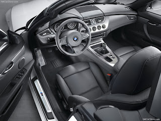
Z4 No Longer Just a Fancy Miata
I finally saw a newer Z4 on the road the other day. At first glance, the tail lights looked more like a 6 series, but I quickly realized it was the new Z4. See, the last time I took note of the new Z4, it was in featured in a blog in the "baby boomer beige" color. It had instantly made am impression on me that it was no longer a sports car, but just a luxury convertible. I would like to say that the old adage,"you never get a second chance to make a first impression," does not apply to the automobile.
I first notice how much smoother and sleeker it is overall. It still has some very nicely chiseled lines, but they don't interrupt the body like on the previous model. I am particularly fond of the sweeping character line that starts with the curve of the bonnet, and dives towards the rear wheel to meet with the muscular, yet sexy wheel arch. The lower line between the wheels angles up nicely, and helps accentuate a slight coke bottle curve behind the front wheel. Above that, the vent gets thinner and pointer, yet still looks like it serves a purpose. The BMW roundel no longer serves as a turn signal. It was clever, but is too clunky for this Z4.
I can't forget to mention the retractable hardtop. It's not incredibly obvious that it's a convertible. Not many do that well. Whether it fools you or not, the roof line, shape and proportions are so undeniably classic, that I can't help but compare the silhouette to a Jaguar e-type or a Ferrari GTO 250. Too soon? Okay, maybe I got just a little too excited.
There's not much that I don't love about this new car. And, in nearly every way, I think it is superior to it's predecessor in design and sex appeal. Unless it's in beige.
Labels:
aggressive,
BMW,
convertible,
design,
hardtop,
redesign,
timeless,
Z4
Subscribe to:
Posts (Atom)


